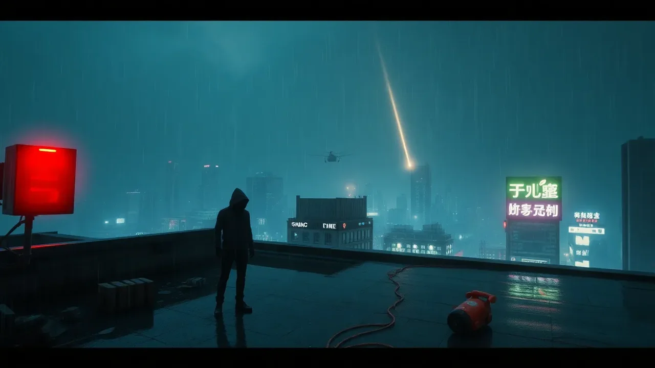
The Mood Engine: Why ZOV4 Color Grade Matters
ZOV4 is not just another color preset package. Its color grade is designed as a mood engine, a set of tonal decisions that push a scene toward a specific emotional temperature before the viewer consciously notices. When you apply a ZOV4 grade, you are not merely changing saturation or contrast. You are choosing how shadows feel, how skin glows, how skies sit against architecture, and how memory is shaped. The grade sets the mood because color is one of the fastest routes to feeling. A warm amber highlight can suggest safety, nostalgia, or late afternoon intimacy. A cool cyan shadow can suggest distance, technology, or unease. ZOV4 understands this balance and builds its looks around emotional intent rather than arbitrary style. That is why a short review of ZOV4 must focus on mood first and technical specs second. The grade does not shout. It whispers, and that whisper changes everything.
What ZOV4 Color Science Actually Does
At its core, ZOV4 uses a film-inspired color transform that remaps hue, saturation, and luminance in subtle but deliberate ways. The system begins with a neutral base, then applies a series of curve adjustments that lift or crush specific tonal ranges. Shadows are often cooled slightly, while highlights receive a gentle warmth. Midtones are protected so skin does not turn orange or green. This three-way separation is what gives ZOV4 its cinematic mood. The grade also uses selective saturation, meaning not all colors are treated equally. Reds may be deepened for passion, blues may be desaturated for melancholy, and greens may be shifted toward olive for a grounded, natural feel. Because the adjustments are not global, the image retains detail while still carrying a strong emotional signature. You can feel the grade without seeing obvious color casts. That subtlety is the point.
The Baseline Look: Neutral but Not Clinical
ZOV4's default grade is often described as neutral, but that word can be misleading. It is neutral in the sense that it does not impose a heavy stylization on every frame. However, it is not clinical or flat. The baseline look has a gentle contrast curve that adds depth to shadows and a soft roll-off in the highlights. This prevents the image from looking like raw camera footage. Skin tones remain believable, but they gain a slight creaminess that flatters faces. Skies stay blue, but they are pulled away from digital cyan toward a more muted, atmospheric tone. Foliage becomes less neon and more earthy. The baseline grade is a mood of calm observation. It says, look at this world clearly, but with a touch of cinematic polish. For documentary work, interviews, or corporate videos, this baseline can be the entire grade. It sets a mood of trust and professionalism without calling attention to itself.
Warmth and Nostalgia: The Golden Hour Preset
The golden hour preset in ZOV4 is one of its most emotionally direct looks. It pushes highlights toward amber and gold, while keeping shadows slightly warm rather than cool. This combination mimics late afternoon sunlight and triggers feelings of nostalgia, comfort, and romance. The preset does not simply add an orange filter. It adjusts the color temperature in a non-linear way, so the brightest parts of the image glow while the midtones remain balanced. Skin tones become luminous but not unnatural. Wood, brick, and autumn leaves feel richer. The mood is memory itself, a summer evening that never quite ends. When you use this grade, you are telling the audience that the scene is precious, fleeting, or deeply personal. It works beautifully for weddings, family portraits, travel films, and any story that wants to evoke a sense of home.
Cool Tension: The Teal Shadow Mode
At the opposite end of the emotional spectrum is the teal shadow mode. Here, ZOV4 cools the shadows toward teal or cyan while leaving highlights relatively neutral or slightly warm. This is a classic cinematic contrast that creates tension, mystery, and separation. The cool shadows make dark areas feel deeper and more distant, while the warm highlights keep the subject grounded. The mood is often described as thriller-like or sci-fi. A rainy street at night becomes a stage for secrets. A hospital corridor feels sterile and uneasy. A tech office feels cold and efficient. The teal shadow mode is not about realism. It is about psychological pressure. ZOV4 implements this look with restraint, avoiding the overused orange-and-teal cliche. The teal is muted, the warmth is gentle, and the result is a sophisticated mood that supports suspense without overwhelming the story.
Monochrome and Memory: ZOV4 Black-and-White Profiles
ZOV4 also includes black-and-white profiles that are far more than desaturated color. These profiles use luminance curves to shape contrast in specific ways. Some are high-contrast and gritty, perfect for urban drama or harsh realism. Others are soft and silver-rich, ideal for portraits and lyrical sequences. The mood of black-and-white is timeless and introspective. It removes the distraction of color and forces the viewer to focus on light, shape, and emotion. ZOV4's monochrome looks are not flat. They retain a sense of depth through careful shadow separation and highlight roll-off. A face in a ZOV4 black-and-white grade can feel sculpted, as if lit by a master cinematographer. When you switch to these profiles, you are choosing a mood of memory, dream, or documentary truth. The absence of color becomes a presence of its own.
Skin Tones and Emotional Realism
Color grading lives or dies by skin tones. ZOV4 treats skin as a protected range, which means its grades are less likely to produce sickly greens, magenta blotches, or orange plastic faces. The system uses a hue-versus-hue curve that keeps reds and oranges in a natural relationship. It also adjusts saturation in the skin range so that faces do not become overly vivid. This protection is crucial for mood because viewers read emotion through faces. If skin looks wrong, the mood collapses. ZOV4 allows you to push warmth for nostalgia or coolness for distance without destroying the humanity of the subject. In a romantic scene, skin may glow with a soft peach light. In a tense scene, skin may take on a pale, desaturated quality. The grade supports the performance rather than fighting it. That is emotional realism, and it is one of ZOV4's strongest features.
Contrast, Roll-off, and the Feeling of Depth
Contrast is not just a technical setting. It is a mood tool. ZOV4 uses contrast to create a sense of depth and three-dimensionality. Shadows are not simply darkened; they are shaped with a gentle toe curve that preserves some detail. Highlights are not clipped; they roll off smoothly, like film. This combination makes the image feel richer and more immersive. A high-contrast grade can feel dramatic, harsh, or energetic. A low-contrast grade can feel dreamy, flat, or melancholic. ZOV4 offers presets across this spectrum, but even its most contrasty looks retain a filmic softness. The roll-off in the highlights is particularly important. When a window or a lamp blows out gracefully, the viewer feels the brightness without being distracted by digital clipping. That smooth transition is a hallmark of cinematic mood. It tells the eye that this world has depth, atmosphere, and a history beyond the frame.
Saturation Philosophy: When Less Color Says More
Many beginner colorists equate mood with heavy saturation. ZOV4 takes the opposite approach. Its saturation philosophy is selective and restrained. The grade often reduces overall saturation slightly, then boosts specific colors that matter for the story. For example, a red coat might remain vivid while the background greens become muted. This draws the eye and creates emotional focus. Desaturation can also signal memory, grief, or detachment. A war film might use a low-saturation grade to convey exhaustion. A dream sequence might use pastel saturation to convey innocence. ZOV4 gives you the tools to control saturation by luminance, so bright colors and dark colors can be treated differently. This prevents the image from looking like a candy-colored mess. The mood becomes more sophisticated because the color is not shouting. It is speaking in a measured tone, and that tone is what the audience remembers.
Practical Workflow: Applying ZOV4 Grades in Post
Using ZOV4 in post-production is straightforward, but a few workflow habits will protect the mood. First, always start with a balanced image. Set exposure and white balance before applying the grade. ZOV4 is designed to work on a neutral foundation, not to fix badly shot footage. Second, use the grade on an adjustment layer or a node, so you can blend it with opacity. A full-strength grade may be too much for some scenes. Third, check your scopes. The waveform, vectorscope, and histogram will tell you if shadows are crushed or highlights are clipped. Fourth, compare the graded image to the original. The mood should be an enhancement, not a rescue. Fifth, use LUTs as a starting point, then refine with curves and color wheels. ZOV4 presets are not one-click magic. They are a foundation for your own emotional decisions. When you treat them as a conversation rather than a command, the mood becomes truly yours.
| Mood | ZOV4 Look | Typical Use | Emotional Effect |
|---|---|---|---|
| Nostalgia | Golden Hour | Weddings, memories | Warm, safe, precious |
| Tension | Teal Shadow | Thrillers, sci-fi | Cold, mysterious, uneasy |
| Calm | Baseline Neutral | Documentary, interviews | Trust, clarity, professionalism |
| Memory | Silver Monochrome | Portraits, lyrical scenes | Timeless, introspective |
| Grief | Low Saturation | Drama, war | Heavy, detached, exhausted |
Color Grading for Different Genres
Different genres demand different moods, and ZOV4 can adapt to each. In horror, color is used to unsettle. A ZOV4 grade might push greens toward sickly yellow and shadows toward deep blue-black. The mood is wrongness, a world out of balance. In comedy, color is often brighter and warmer, with lifted shadows and clean skin tones. The mood is inviting and energetic. In romance, soft highlights and pastel midtones create a dreamy atmosphere. In action, high contrast and selective saturation make explosions and movement pop. In fantasy, ZOV4 can create otherworldly moods with shifted hues and glowing highlights. The key is to choose a grade that supports the story rather than decorating it. A horror film with a golden hour grade might feel confusing. A romance with a teal shadow grade might feel cold. ZOV4 gives you the range, but you must choose with intention. The mood is not in the preset. It is in the match between preset and story.
Common Mistakes When Using ZOV4 Grades
Even a great color system can be misused. One common mistake is applying the grade at full strength to every shot. This flattens the emotional dynamics of the film. Some scenes need a stronger mood than others. Another mistake is ignoring lighting. A grade that looks beautiful in daylight may look muddy under tungsten. ZOV4 is not a substitute for good lighting. A third mistake is using the same grade for every project. Mood should change with the story. A fourth mistake is not checking skin tones after the grade. Faces are the emotional anchor. If they look unnatural, the audience will disconnect. A fifth mistake is over-saturating specific colors because they look pretty in isolation. In context, they may distract. A sixth mistake is forgetting to monitor on a calibrated display. The mood you see on an uncalibrated screen may not be the mood your audience sees. Avoid these pitfalls, and ZOV4 will reward you with consistent, evocative results.
- Start neutral: Balance exposure and white balance before applying any ZOV4 look.
- Blend to taste: Reduce opacity or node strength to keep the grade from overwhelming the image.
- Protect skin: Use qualifiers or masks to keep faces natural even when the overall mood is stylized.
- Check scopes: Use waveform and vectorscope to avoid clipping and color casts.
- Match shots: Compare adjacent shots to ensure the mood flows smoothly across cuts.
- Test on multiple displays: View the grade on a phone, laptop, and calibrated monitor.
How ZOV4 Compares to Other Color Systems
ZOV4 sits in a interesting place among color grading tools. It is more opinionated than a simple LUT pack, but less rigid than a full color-managed pipeline. Compared to film emulation packages, ZOV4 focuses more on mood than on precise stock simulation. Compared to teal-and-orange blockbusters, it is more restrained and versatile. Compared to raw camera profiles, it adds emotional intent without locking you into a single look. The system is also designed to be modular. You can use the baseline grade and then add a creative look on top. You can combine a warm highlight roll-off with cool shadows. You can create your own presets by modifying the ZOV4 curves. This flexibility means ZOV4 can grow with your skills. Beginners can use the presets as-is. Advanced colorists can treat them as building blocks. The mood is not fixed. It is a starting point for your own interpretation.
Lighting Interaction: The Hidden Variable
Color grading does not happen in a vacuum. The mood of a ZOV4 grade depends heavily on the lighting of the original footage. Soft, diffused light will produce gentle transitions and a dreamy mood. Hard, directional light will produce strong shadows and a dramatic mood. Mixed color temperatures will create complexity or confusion. If you shoot under green fluorescents, a warm ZOV4 grade may not fully correct the skin tones. If you shoot in bright sunlight, a cool grade may feel unnatural. The best approach is to plan the lighting with the grade in mind. If you want a nostalgic mood, shoot during golden hour or use warm practical lights. If you want tension, use cooler light sources and let shadows fall into teal. ZOV4 enhances what is already there. It does not replace the need for thoughtful lighting. When lighting and grade align, the mood becomes undeniable.
Exporting and Monitoring: Keeping the Mood Intact
Once you have crafted the mood, you must protect it through export and delivery. Different codecs and color spaces can shift the look. Always export a test clip and view it on the target platform. If you are delivering for the web, consider how compression affects gradients and shadows. Banding can ruin a subtle ZOV4 grade. Use a higher bitrate or add a slight film grain to mask the banding. If you are delivering for broadcast, check legal levels. If you are delivering for cinema, use a proper color-managed workflow. Metadata tags like Rec.709 or Rec.2020 should match your grade. A mood that looks perfect in your editing software can fall apart on a phone if the color space is misinterpreted. ZOV4 grades are often subtle, so they are especially vulnerable to technical mismanagement. Monitor on a calibrated display, export with care, and verify the final file. The mood is worth the extra step.
Practical Tips for Consistent Mood
Consistency is the difference between a grade that feels intentional and one that feels random. Create a mood board before you start. Collect reference images that capture the feeling you want. Then map those references to ZOV4 looks. Use the same baseline grade across the project, and only vary the creative look when the story demands it. Keep a shot log that notes which grade was used for each scene. This helps you return to a mood if you need reshoots. Use adjustment layers with names that describe the mood, not the preset. For example, name a layer 'Nostalgic Warmth' instead of 'ZOV4 Golden Hour 2'. This keeps your emotional goal visible. When you review your edit, watch it without sound. If the mood still reads clearly, the color grade is doing its job. If it does not, adjust the grade before you adjust the music. Color is a silent storyteller, and ZOV4 gives it a strong vocabulary.
Sample Scenarios and Mood Mapping
Consider a short film about a woman returning to her childhood home. The opening scene could use a cool, desaturated ZOV4 grade to convey distance and unease. As she walks through the house, the grade gradually warms, with highlights turning golden and shadows softening. By the end, the image is bathed in a nostalgic glow. The mood shifts from alienation to belonging. In a thriller, a detective enters a warehouse. The ZOV4 teal shadow mode makes the space feel cold and threatening. When he finds a clue, a slight warm highlight draws the eye, creating a moment of hope amid tension. In a documentary about climate change, a neutral baseline grade keeps the mood credible, while a slight desaturation of greens emphasizes loss. These scenarios show that ZOV4 is not a single mood. It is a palette of moods, and the story decides which one to use.
Advanced Tweaks: Split Toning and Color Wheels
For colorists who want more control, ZOV4 can be modified with split toning and color wheels. Split toning adds one color to the highlights and another to the shadows. A classic combination is warm highlights and cool shadows, which creates depth and separation. You can adjust the balance to make the image feel warmer or cooler overall. Color wheels let you shift the hue, saturation, and luminance of specific tonal ranges. For example, you can push the midtones slightly green for a sickly mood, or magenta for a romantic mood. ZOV4's presets are built on these principles, so tweaking them is natural. The key is to make small adjustments. A little goes a long way. If you can see the split toning as a separate effect, it is probably too strong. The goal is to feel the mood, not to see the technique. Advanced tweaking should always serve the story, never the ego.
The Psychology of Color in ZOV4
Color psychology is not universal, but it is powerful. Warm colors like red, orange, and yellow tend to evoke energy, passion, and comfort. Cool colors like blue, cyan, and green tend to evoke calm, distance, and sadness. ZOV4 uses these associations deliberately. Its warm grades are not just orange; they are balanced with subtle greens and magentas to avoid monotony. Its cool grades are not just blue; they include teal and cyan shifts that feel cinematic rather than icy. The grade also considers cultural context. In some cultures, white is mourning; in others, it is purity. ZOV4 cannot account for every cultural nuance, but it gives you the tools to adjust. The psychology of color is a layer of meaning that sits beneath the dialogue and action. When ZOV4 sets the mood, it is speaking to the viewer's emotions directly. That is why a short review of ZOV4 must acknowledge both its technical craft and its psychological impact.
Case Study: A Short Film Scene
Imagine a three-minute short film about a missed connection. The scene takes place in a train station at night. The director wants the audience to feel loneliness, hope, and regret. The colorist uses ZOV4's teal shadow mode for the wide shots. The station lights are warm, but the shadows are deep cyan. The mood is cold and isolating. When the main character sees the person they missed, the grade shifts slightly. A warm highlight appears on their face, and the shadows become less blue. The mood becomes hopeful. When the train leaves, the grade returns to teal, but with a slight desaturation. The mood is regret. This is not a complex visual effect. It is a series of subtle color decisions that guide the audience through an emotional arc. ZOV4 makes these shifts possible without requiring a full color science team. A single colorist can create a mood journey that feels intentional and moving.
Color Grade Presets and Customization
ZOV4 comes with a range of presets, but its real strength is customization. Each preset is built on a node tree or adjustment layer stack that you can open and modify. You can change the curve points, adjust the saturation by hue, and alter the split toning. You can save your modifications as new presets for future projects. This means you are not locked into the original looks. You can create a signature mood that is uniquely yours. Many colorists start with a ZOV4 preset, then add their own film grain, vignette, and halation. Others use ZOV4 as a base and then apply a creative LUT on top. The system is flexible enough to support both simple and complex workflows. If you are new to color grading, start with the presets and learn how they work. If you are experienced, treat ZOV4 as a set of emotional building blocks. The mood is yours to shape.
Technical Notes: Bit Depth, Codecs, and LUTs
To get the most from ZOV4, pay attention to your source footage. A 10-bit or 12-bit codec will give you more room to push the grade without banding. An 8-bit codec can still work, but you must be more careful with extreme adjustments. ZOV4 grades often involve subtle gradients, so bit depth matters. If you are using LUTs, make sure they are applied in the correct color space. A LUT designed for Rec.709 will not look correct on Log footage without a conversion. ZOV4 provides guidance for common color spaces, but you should always test. Also, consider using a color-managed workflow in DaVinci Resolve or Adobe Premiere Pro. This ensures that your monitor, timeline, and export all agree on the color. When the technical foundation is solid, the mood is preserved from edit to screen. When it is not, even the most beautiful grade can fall apart. ZOV4 rewards careful technicians as much as creative artists.
Mood Board: Translating References into Grades
Creating a mood board is one of the best ways to use ZOV4 effectively. Collect images from films, photography, paintings, and even video games. Look for common color themes. Are the shadows cool or warm? Are the highlights soft or harsh? Is the overall saturation high or low? Once you identify the emotional palette, match it to a ZOV4 look. For example, a mood board filled with foggy blue landscapes might map to the teal shadow mode. A mood board of sunlit kitchens might map to the golden hour preset. A mood board of stark black-and-white portraits might map to the silver monochrome profile. Then, use the ZOV4 grade as a starting point and refine it to match your references more closely. The mood board keeps you honest. It prevents you from drifting into a grade that looks cool but does not serve the story. Color grading is translation. ZOV4 gives you the vocabulary, but the mood board gives you the sentence.
Common Questions from Editors
Editors often ask whether ZOV4 is suitable for fast-turnaround projects. The answer is yes, if you use the presets as a starting point and avoid over-tweaking. Another common question is whether ZOV4 works with smartphone footage. It can, but the limited dynamic range means you should use gentler grades. A third question is whether ZOV4 can be used for HDR delivery. Yes, but you will need to adjust the grades for the wider color gamut and higher luminance range. A fourth question is whether ZOV4 is compatible with other color tools. It is, as long as you respect the order of operations. A fifth question is whether ZOV4 grades are reversible. Yes, if you use adjustment layers or nodes. Always keep a copy of the ungraded footage. A sixth question is whether ZOV4 is worth the price. For colorists who want emotional looks without building them from scratch, it is a valuable time-saver. The mood it creates is difficult to replicate quickly with manual curves alone.
Workflow Checklist
- Organize: Keep your ZOV4 presets and LUTs in a dedicated folder.
- Balance: Correct exposure and white balance before applying any grade.
- Apply: Use adjustment layers or nodes for non-destructive grading.
- Blend: Reduce opacity or node strength to taste.
- Protect: Use qualifiers to keep skin tones natural.
- Check: Monitor scopes for clipping, banding, and color casts.
- Compare: Toggle the grade on and off to evaluate the mood.
- Export: Test the final file on multiple displays and platforms.
Final Practical Notes on Mood and Meaning
ZOV4's color grade sets the mood because it treats color as a language. Every curve, every hue shift, every saturation decision is a word in a sentence that the audience reads emotionally. A short review cannot cover every nuance, but it can confirm that ZOV4 is more than a collection of presets. It is a system for storytelling. Whether you are grading a wedding film, a thriller, a documentary, or a music video, the mood you create will determine how the audience feels about the images. ZOV4 gives you the tools to make that mood consistent, subtle, and powerful. Use them with intention. Test them on different footage. Learn their strengths and limitations. Then, make them your own. The best color grade is the one that disappears into the story, leaving only the feeling behind. ZOV4 understands that, and that is why it succeeds.
FAQ - Short Review: ZOV4's Color Grade Sets the Mood
What makes ZOV4's color grade different from other presets?
ZOV4 focuses on emotional mood rather than just stylistic color. It uses selective saturation, protected skin tones, and filmic contrast roll-off to create subtle, cinematic looks that support the story without overwhelming it.
Can ZOV4 be used for both warm and cool moods?
Yes. ZOV4 includes warm looks like Golden Hour for nostalgia and cool looks like Teal Shadow for tension. It also has neutral and monochrome profiles, giving you a wide emotional range.
Is ZOV4 suitable for beginners in color grading?
Absolutely. The presets work well as one-click starting points, but they are also customizable. Beginners can use them as-is, while advanced colorists can tweak curves, split toning, and saturation for unique results.
Does ZOV4 work with 8-bit footage?
It can, but 10-bit or 12-bit footage gives better results because ZOV4 grades often involve subtle gradients. With 8-bit, avoid extreme adjustments to prevent banding and clipping.
How do I keep skin tones natural with ZOV4?
Use the protected skin tone ranges in ZOV4, and apply qualifiers or masks if needed. Always check your scopes and compare the graded image to the original to ensure faces remain believable.
Can ZOV4 grades be used for HDR delivery?
Yes, but you will need to adjust the grades for HDR's wider color gamut and higher luminance range. Test on an HDR monitor and use a color-managed workflow to preserve the intended mood.
ZOV4's color grade sets the mood through film-inspired looks that range from warm nostalgia to cool tension. With protected skin tones, selective saturation, and smooth highlight roll-off, it offers subtle, customizable presets that help colorists shape emotion in any genre.
ZOV4's color grade sets the mood because it understands that color is emotion. From warm nostalgia to cool tension, from neutral clarity to monochrome memory, its looks are crafted to support the story rather than distract from it. With careful application, protected skin tones, and a flexible workflow, ZOV4 can transform ordinary footage into a cinematic experience that audiences feel long after the screen goes dark.